Modern iO Design Templates
Follow these effective Direct Mail Retargeting designs.
Direct Mail Retargeting Postcards are an ideal marketing touch: customers are already interested in your site, and this channel drives them down along the customer buyer journey.
Most marketers have never designed for Direct Mail Retargeting, and make mistakes that lower the response rate and effectiveness.
These design templates help you apply best practices of successful Direct Mail Retargeting when designing the postcard layout.
Example of an effective frontside layout
A common misconception is that since customers have already been to your website, you only need to present an offer and image on the card. Postcards are direct-response physical marketing, not print or digital advertising. To be effective you need to tell your unique story, have a clear call-to-action, and demonstrate social proof.
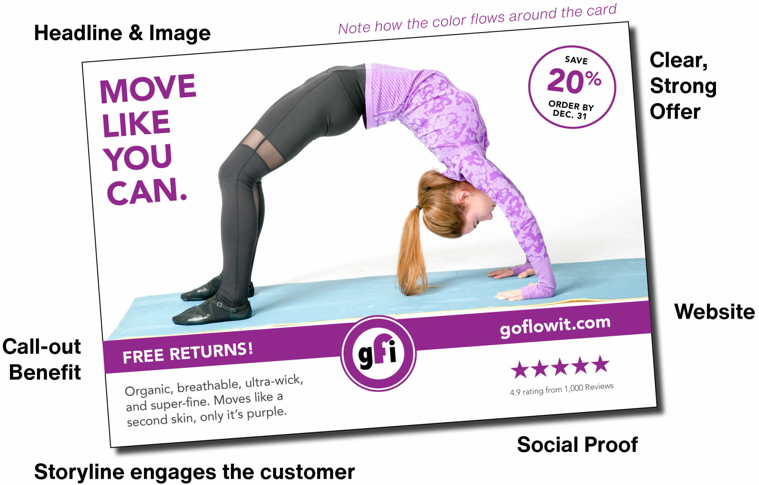
- Headline: Use a compelling, active-voice statement of no more than 7 words (like an email subject line)
- Clear & Strong Offer: Make sure that you have something valuable, and use an expiration date to drive urgency
- Contact: Make sure you include your website or phone number
- Call-out Benefit: Get attention and intrigue the recipient
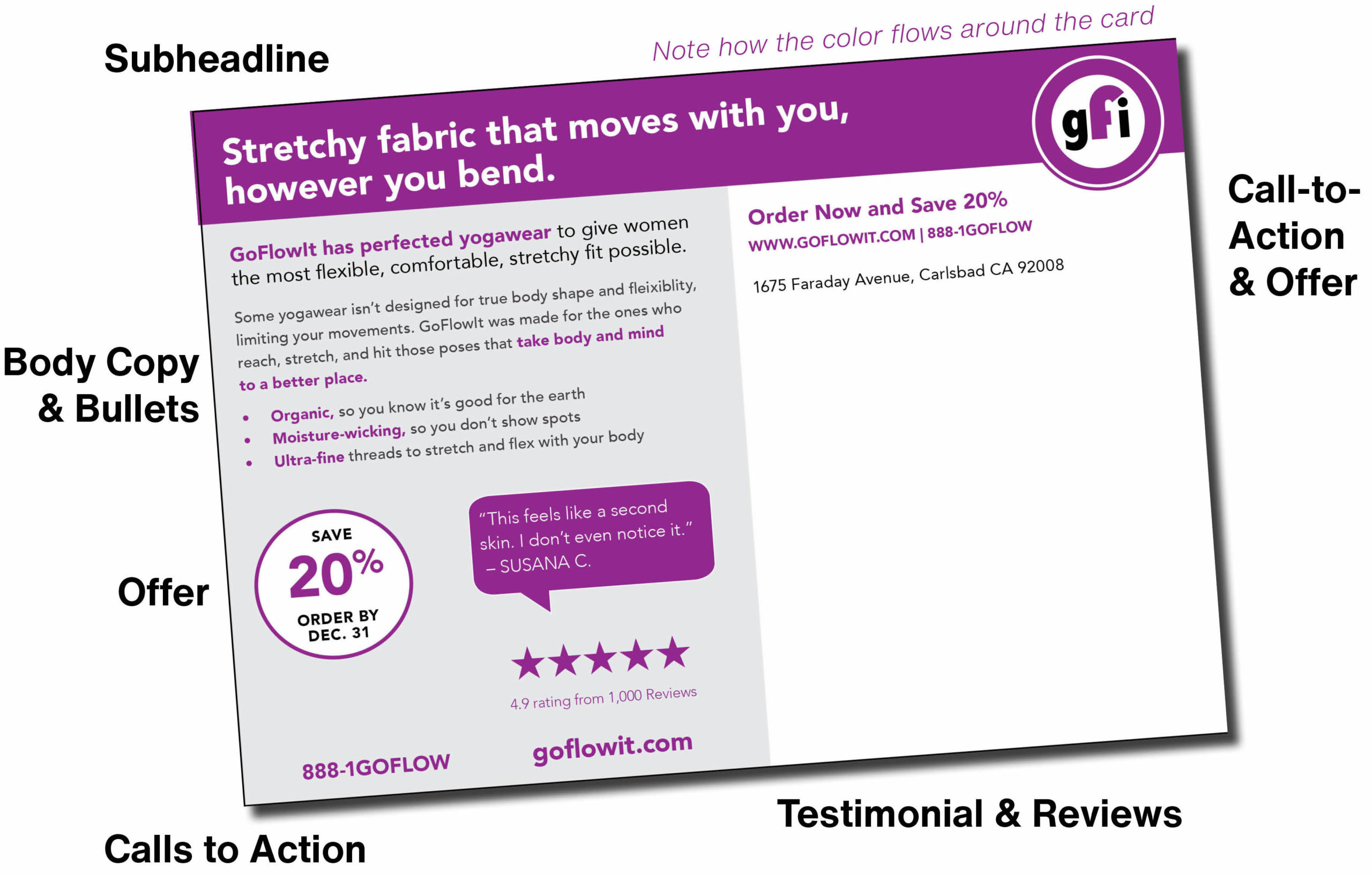
Example of an effective backside layout
Because mail is often delivered address-side up in the mailbox, your prospect could see this side first. Write and design a strong headline and compelling offer so they pause and give your message a look.
- Backside Subheadline: Reiterate the benefit for the customer
- Backside Copy: Tell the story of your business. Don’t just have an image and an offer, and instead make sure your reader knows that you’re speaking to what’s important to them
- Call-to-Action: Make sure you’re telling the reader exactly what they should do next when they read the card
- Contact Information: Add a phone number, website, etc. so they know how to reach you
- Offer: Make sure this is highlighted on the piece and is simple to understand
- Testimonial or Social Proof: More people buy because of good reviews, so include them in the design
- ADDED ITEMS: Think about QR codes, opt-in Text Codes, and other interactive elements
Downloadable Design Templates
Use these templates to help design your own card. These are packaged layouts with greyed-out elements (photos, text, etc.) so you can use our best practices to guide your images, copy, and offer. Each file has a properly-sized Standard 4.25″ x 6″ and Jumbo 6″ x 9″ version.
Direct-to-Consumer
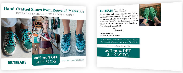
This design has proven to drive high response and conversion for DTC brands. The layout takes advantage of the space without looking cluttered: a strong offer, a testimonial; a message from the founder; a concise storyline; and a variety of images.
Design Features: Multiple photos, big offer on the front. Uses a strip for a real customer testimonial and space for more text.
Best Uses: Brands with multiple photos or images and a concise, clear, unique story with a strong customer quote.
Consumer Services
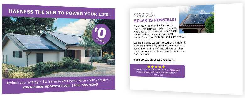
Consumer services are usually not an impulse purchase – they’re planned. The card is designed to ‘hang around’ the house – on the fridge, table, etc. – until the visitor is ready to act by calling or going back to the website to fill out an appointment or form.
Design Features: Big image on the front, with color bars to emphasize and make the headline and subheadline easy to read. Plus, a big “spot” for the offer.
Best Uses: If you need a bit more copy, the backside offers a larger section separated from a secondary image or photo on the back. In addition, a color block for testimonials and contact information makes that content easy to read.
Organization/NonProfit
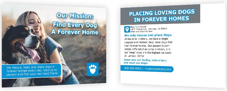
Organizations need to remind visitors why they should be considered over other choices, and drive them into action. The message should focus on why they visited the site in the first place, and what piqued their interest. The copy can be a bit longer to emphasize that message.
Design Features: Use a color bar on top of the photo to add more descriptive text. The backside has room for longer copy and a storyline, with fewer visual distractions so the reader can better read the message.
Best Uses: For organizations that need to remind visitors why they came to the site, and the clear point of difference they offer versus other choices.

