
Color Overview
We Accept Files in RGB, CMYK, Pantone,* and any Color Space
* If the reproduction of your Pantone (aka PMS or spot) color is critical, send us a physical sample. Pantone’s library of colors have both expanded greatly and been updated, sometimes causing unreliable conversions among the different desktop publishing applications.
Submitting Digital Images
Let Modern do the work for you. Simply submit your digital images as-is and we’ll take care of the color management.
Submitting Press-Ready Layout Files
If you are building your own layout, let us guide your color management with our Color and PDF Export settings.
About Color
Color Models/Color Spaces (Lab, RGB, CMYK)
A color space is a range of colors in the visible spectrum, and is synonymous with color profiles as used in color management. A model of a color space is usually depicted as a 3D graphic, where the top of the graphic represents light hues, and the bottom represents dark hues. The peripheral area represents pure colors and the center represents gray.
LAB, RGB, and CMYK are all color spaces. Here is a brief breakdown of each, followed by more detailed descriptions:
The LAB color space is what people see and is comprised of more colors than either RGB or CMYK. RGB is the color space used by cameras, scanners and color monitors. CMYK is what most printers lay on paper. LAB is the largest color space, and CMYK is usually the smallest of these three. Some colors as seen on a monitor (RGB) cannot be reproduced in print (CMYK). And some colors in print cannot be viewed on a monitor. Those specific colors are called “out of gamut.”
LAB
The most universally accepted system for color measurement is the CIE system, developed in 1931 by the International Commission on Illumination – abbreviated CIE from its French title Commission Internationale de l’Eclairage. In an effort to better refine color measurement, CIELAB was developed in 1976. The CIELAB model is primarily used for reflective color. Properly designated L*A*B*, this color space is used to define color values mathematically. L* represents lightness. The A* value represents the position on a magenta-green axis. The B* value is the position on a yellow-blue axis. CIELAB encompasses the entire visible spectrum, and is called “Lab Color” in Photoshop.
RGB
The RGB color model is a projected color space, and is the type produced by computer monitors and TVs. This color space is device dependent – meaning the same signal or image can look different on different devices. Images are created using the Additive Color Primaries, Red, Green, and Blue. RGB is additive because when these primary colors are combined at a value of 100% for each, they produce white light. When they are combined at different values millions of colors can be produced, but they cannot be used to define the entire visible spectrum.
CMYK
The CMYK color model is a reflected color space and is created when light bounces off printed material. Reflected color is produced using the Subtractive Primaries, Cyan, Magenta, and Yellow. CMY primaries are subtractive because they absorb light. The colors we do not see are absorbed by the inks and subtracted from the visible spectrum. The colors that are not absorbed and reflected back are the colors we see. Combining these Primaries at different percentages will produce many of the colors in the visible spectrum.
Why the K in CMYK?
When the Additive RGB Primaries are absent, black is the result. When the Subtractive CMY Primaries are combined, black should be produced, but due to ink limitations, the result is a muddy brown. Black ink is added to ensure that a true black is possible. Black ink also ensures that enough definition will be maintained in the printed image.
ICC Printing Profiles
What Is A Profile?
A profile describes the colors reproduced by a device, such as a camera, a scanner, a monitor, an inkjet printer, and a printing press. The profiles you have downloaded from our website, define the color space of MP’s printing press. The color space referred to is the total possible colors reproduced by the inks (Cyan, Magenta, Yellow, and Black) used on MP’s press. When utilized within a color management system, printing industry technicians, like ourselves, can control color output with a great degree of consistency and predictability. Profiles can be used, but not opened. They are like tags of information that can ride along with a file. Depending on preferences within certain applications, they can be ignored or implemented according to color management settings.
When our clients use our press profiles, they can get a better idea of how their files will print on our press. For example, let’s say you have a well-calibrated monitor, and you’ve just prepared an image file on it. You like what you see, and you want it to print that way. All you have to do is convert it to a profile that describes the press your file will print on. We provide three such profiles, and here’s a description of each:
Profiles Include
MP_Color_CMYK_(date).icm:
Our most popular profile and used for full color images.
MP_B&W_CMYK_(date).icm:
This is used for Black and White images, but utilizes all 4 colors (CMYK) at our press.
MP_B&W_Gray_(date).icm:
This is used for grayscale images (Black ink only) on the backside of our postcards.
Placement of Profiles
Adobe Photoshop (and other ICC-compliant applications) can use profiles. Place our profiles into the appropriate folder according to your operating system as listed below.
Mac OS 9.x or earlier – Hard Drive / System Folder / ColorSync Profiles
Mac OS X or later – Hard Drive / Library / ColorSync / Profiles
In Windows, you can right-click on a profile in any location to get a menu containing an option to “Install Profile,” which will place it in the appropriate directory. Below is a list of the typical paths for different versions of Windows.
- Win98, Win98SE, WinME: C: \ Windows \ System \ Color
- Win2000: C: \ WinNT \ System32 \ Spool \ Drivers \ Color
- WinXP: C: \ Windows \ System32 \ Spool \ Drivers \ Color
- Win NT: C: \ WinNT \ System32 \ Color
Notes:
The location for profiles under Windows NT is just for reference. Windows NT has no built-in color management. Any color management is done entirely by applications.
We update our press profiles at least twice a year. Be sure to download our most recent press profiles before submitting a job.
Embedding Profiles or Tagging Images
If an image file does not have a profile, or in other words, if a profile was not embedded when the image file was saved, it would be considered “untagged.”
When you embed a profile into an image file, others can recognize your file as being prepared in a certain color space. Your image file can then be color managed, which means you will have a better chance of getting from your printer what you’re expecting. If your image file is not tagged, others would either have to guess when attempting color management, or not color manage your file at all, which is usually the case.
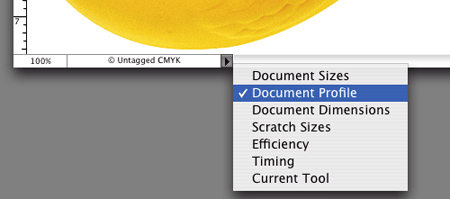
This image capture shows you one way to check if an image file has an embedded profile. In this scenario, it does not have an embedded profile so the document’s profile is labeled “Untagged CMYK.”
MAC:
This image is of the lower portion of an image file as opened in Photoshop. By clicking on the black triangle to the right of the information window, you can view a document’s profile. If a profile is not embedded, it will be considered untagged.
PC:
To view same information on a PC, from the Window menu, select Status Bar and instead of looking at the bottom of the file window, the information will be at the bottom of the application window.
Converting to Profiles in Photoshop
In Photoshop 6, 7, or CS, go to:
- Image/Mode/Convert to Profile
In CS2, go to
- Edit/Convert to Profile
A dialog will open like this:
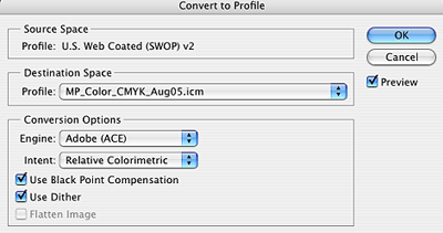
The Source Space is the current working space loaded in Photoshop’s Color Settings. The Destination Space is selected from the drop-down menu. Choose the appropriate profile if you are sending your image to us. The Conversion Options should be set as they appear in the above screen capture. Clicking OK will convert the document to the new color space. The color values in the file will change to accommodate the new color space, but its appearance should not change.
Embedding Profiles in Photoshop
There are two ways to embed a profile. One method is automatic and is controlled in Photoshop’s “Color Settings” dialogue by choosing “Preserve Embedded Profile.” When you save an image file that either has a profile assigned to it or was converted to a profile, that profile will be embedded.
The Color Settings dialogue is located under the menu headers Photoshop, File, or Edit depending upon your operating system (Windows, Mac OSX, OS 9 or earlier, and version of Photoshop).

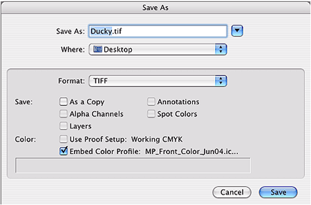
Another option, which will override the Color Settings dialogue, is when you do a Save As function and check the appropriate radio button like this:
Assigning Profiles in Photoshop
Assigning a profile is nothing more than viewing an image file as it would appear on another device. Color values within the image file will not change, but its appearance will.
For example: If you are viewing an image file that has the embedded profile of SWOP (U.S. Web Coated (SWOP) v2) and assign it our profile (MP_Front_Color), you would notice certain colors shifting. Among other differences, flesh tones would probably become more orange and blues more purple.
In Photoshop 6, 7, or CS go to:
- Image/Mode/Assign Profile
In Photoshop CS2 go to:
- Edit/Assign Profile
Now you’ll know how your image file would have printed if you didn’t first convert it to the press profile of your printer. But you’ll want to convert your image file first.
Note:
You can only assign profiles that are from the same color space as the image file. In this case, that color space is CMYK, a printing color space. Many Photoshop users prepare their CMYK image files in Photoshop’s default CMYK color space (SWOP) as used in the above example. Therefore, converting from SWOP to your printer’s press profile usually renders good results. If preparing files in an RGB color space, convert directly to your printer’s press profile.
Photography Tips
While the ideal situation would be to have a professional take on this portion of the project, it is possible to do it yourself – if you follow the rules. To understand this subject in more detail, we recommend an Internet or library search for more information. Here are a few basic tips to get you started:
Flat Art
Photographing flat artwork (paintings, drawings, etc.) is a straightforward process, but it is not always easy. To be done right it requires precise setup, as well as special equipment and materials. Also: The axis of the camera should be perpendicular to the center of the artwork. The lighting must be even across the artwork. Reflections must be eliminated using polarizing filters. An indoor lighting setup requires at least two lights, which should initially be placed 45 degrees to either side of the artwork, but may need to be moved due to reflections.
Object Art
Photographing three-dimensional art is an art in itself. This is a service that most customers hire a professional to do, simply because the variables involved can be difficult to anticipate without the proper equipment and experience. If you want to do it yourself, consider these tips: Light the art for medium contrast. Use a minimum 1:3 lighting ratio, but no greater than 1:5. Always use light diffusers to soften shadows. Use a background that is not distracting, and that will contrast well with your art.
Film
Contrast should be medium or low. High-contrast films will be difficult to scan, and may produce empty shadows and blown-out highlights. Choose fine-grained films designed for accurate color reproduction. Avoid films with boosted color saturation.
Stock Photography
There are hundreds of companies that provide digital images. Some are even free (i.e., from our Photo Gallery), but all of them are either captured on camera, or scanned, or created with the aid of image editing applications. Some products from these companies are done well, and some are not done well. You will have to be the judge. For more information about stock photography, see resources below.
Digital Cameras
Over the past few years significant advances have been made in the digital camera arena. Costs are down and pixels are up. Quality has improved dramatically to the point that a good camera no longer costs thousands of dollars. Now just the really, really good ones cost that much.
In short, there are two things that contribute more to the success of a good digital camera than anything else. Those two things are the chip and the lens. And actually there’s a third factor, the photographer. Even a great camera can’t help a bad photographer.
In general, the more pixels you can capture, the better the resulting digital image file. Similar to capturing an image with a digital camera, our scanners capture digital image files from original slides or photos. When a slide or photo is scanned at 355ppi (our standard imaging resolution), a resulting standard sized image (4.25″ x 6″) is around 2000 x 1500 pixels. A deluxe sized image (6″ x 8.5″) would be around 3,000 x 2,250 pixels. Therefore, a 3 MegaPixel camera can capture a similar number of pixels as in the example using the standard sized scan. While a 7 MegaPixel camera can capture a similar number of pixels as in the example using the deluxe sized scan.
If you utilize interpolation as discussed in another topic, you can resize the standard sized image, caught with a 3 MegaPixel camera, to 150%. That would result in a digital image suitable for printing a deluxe postcard. But check out the detail. Quality might be compromised.
Lighting Conditions
Lighting conditions around the area of your workstation are important. This is true whether you are viewing digital image files on screen, or photos or slides in a viewing station. Lighting conditions will affect your perception of brightness, contrast and color.
Ambient lighting needs to be considered when viewing files displayed on your monitor. Working in a bright room tends to yield files that are darker than expected when printed. A dark room does the opposite. Somewhere in between is recommended. In general, it is recommended that a room be darker than lighter, but also consistent from morning through night. Viewing hard copies, such as photographs, transparencies, and color proofs, should be done with the aid of 5,000 degree Kelvin, color-correct light – a standard of the printing industry. Such lighting is similar to daylight, though not as bright, and allows you to accurately see the full visible spectrum of colors in photos and transparencies. Non color-correct incandescent or fluorescent lighting will affect your perception of color.
We view colors with the aid of GTI D5000 Transparency/Print Viewers, which utilize color-correct 5,000k lighting. If your lighting conditions are different, your perceived color will also be different.
Digital Resolution
What is a Pixel?
A pixel or “picture element” is the smallest part of a digital image. Greater numbers of pixels in a digital image usually means a larger image and/or greater detail within said image.
Resolution – File vs. Print
Digital file resolutions and printing resolutions are not the same. A digital file’s resolution is determined by pixels per inch (PPI). A print’s resolution is measured by dots per inch (DPI).
In general, higher resolutions (both PPI and DPI) result in greater detail. Final quality will be determined by the operator, the equipment, and the applications used.
Interpolation/Resampling – Altering a File’s Resolution
Resampling is an imaging method, via interpolation of the picture elements, that increases or decreases the number of pixels in the image. Virtually all image editing software support one or more methods of interpolation. Its effectiveness is based on a program’s algorithms. Some are better than others, but all will change the original image integrity and distort/blur the pixels.
If when resampling, the image’s pixel dimensions change, then so will it’s perceived quality. In general, it is not recommended to resample/resize/interpolate an image less than 50% or more than 150% of its original size. Otherwise, undesirable effects could be introduced to the image, which include but are not limited to jaggedness, blurriness, or a loss of detail.
Additional Resources
Photography:
http://www.nitaleland.com/articles/photographing.htm
Books:
Photographing Your Artwork — by Russell Hart, Nan Starr
The Quick & Easy Guide to Photographing Your Artwork — by Roger Saddington
The Artists’ Handbook for Photographing Their Own Artwork — by John White
Mastering Digital Photography and Imaging — by Peter K. Burian
Mastering Digital Printing: The Photographer’s and Artist’s Guide to High-Quality Digital Output — by Harald Johnson
Stock Photography:
http://www.fotosearch.com/ (links to over 50 stock photography sites)
Digital Cameras:
https://www.dpreview.com
https://www.dcresource.com
Monitor Calibration:
https://www.drycreekphoto.com
http://epaperpress.com/monitorcal/
http://www.normankoren.com/makingfineprints1A.html
Color Management:
Scanning:
www.thesprucecrafts.com/photography-4162939
https://www.kenrockwell.com/tech/scantek.htm
Books:
Real World Color Management — by Fraser, Murphy, Bunting
Understanding Color Management — by Abhay Sharma
Color Conversions
When preparing a digital file to print on a commercial press, color conversion is a necessary step. Usually this involves changing a file from one sort of RGB (i.e. sRGB, Adobe RGB (1998), ColorMatch RGB, etc.) to one sort of CMYK (i.e. SWOP, MP_color_date, etc.). In all printing, and at some stage in the process, all files will convert to a printing color space (i.e. CYMK or grayscale). This happens whether you know it (as when printing with us) or not (as when you send an RGB file to a desktop printer).
There might be a color-shift when converting from RGB, Pantone, Spot, LAB, Duotone, Tritone, or Index Color to CMYK. We may require a signed waiver if you submit anything other than CMYK for the frontside of your postcard.
Using Photoshop 6 or Later
Photoshop is the industry standard image editing software. There are many applications available today that are designed for editing digital image files, but Photoshop leads them all in the area of color management. To help ensure accurate color reproduction we highly recommend using this application. Other applications may not support the CMYK color space, or the ability to use ICC profiles. Beginning with Photoshop version 6, Adobe incorporated leading-edge color management tools. If you own an earlier version of Photoshop we highly recommend an upgrade for the color management capabilities alone.
Scanning Tips
Similar to monitors, scanners come in all shapes, sizes, and prices. In general your scans will only be as good as your scanner can produce, and this has a great deal to do with how much you know about scanning. Professional grade drum scanners cost up to $50k, and the training required to operate such devices can take months. Compare that to a $100 scanner and the few hours necessary to learn to operate its software. There’s a lot to say about scanners and scanning that can’t fit in this document. We recommend that you research your options concerning scanners and scanning prior to taking on the task. For quick professional results, we can do your scanning for you. See our Digital Imaging page for more info. For more information about scanners see our Resource List below.
Internet Browsers and Color Management
The color you see while viewing online, accurately or not, depends on a few factors:
- The brand and version of your web browser
- Your operating system
- The brand and model of your display
- The brand and model of your computer
- Your color calibration method and settings
- Your graphics/video card
All of these play a role, but the most important item to consider is #1 on the list. Some browsers don’t use color management. This is very important. Without color management capabilities, an internet browser will not display colors as intended.
For example: Safari on a Mac works well, but not until Safari 3 did that browser color manage on Windows PCs.
An internet search with keywords such as: “web browser color”, “browser color management”, or “internet color management” can help you determine which combination of browser/operating system will work for you.