
Hierarchy in Direct Mail Design
Some would have you believe that content is always king. In the case of direct mail marketing, they’d be wrong.
For this medium, the hierarchy of your design is often more important because without it no one is going to read all that great content. Kings should always look their best.
You want your piece to be read in its entirety, saved, and redeemed to make a sale. The reality is you’ve only got a few seconds to hook your reader’s interest or else it is off to the recycling bin. The headline, the offer, the call to action, and the carefully curated words about why the product you’re selling is the greatest—for you it’s all very important, for the consumer, it can look like a lot to read.
This is why the hierarchy of your design is crucial if you want to draw the recipient into reading and saving your postcard mailer. Maybe you’ve got an attention-grabbing photo, an enticing offer, or a witty headline that draws their eye. Whatever it is, by applying the correct design principles, you can make the content seem much easier to read and significantly increase the likelihood it will be.
Here are some easy design tips to follow to make your mailer stand out in a crowded mailbox.
Size
Bigger is better, or so they say, and larger design elements draw greater attention. With longer headlines for example, you can choose a key word or two to rule them all by giving them more emphasis and drawing the customer in to read the rest. Beyond your headline, however, you should avoid large type. Studies have found that when people encounter large type, they actually do less reading and more skimming. Smaller type for your body copy will allow readers to focus and actually understand your message.
Space
If you have a show-stopping photo, don’t crowd your crown jewel with copy and offers. Give your image and the main headline room to breathe. If you do have lengthy text and your design is feeling cramped, consider going with a larger, folded format or even a booklet. Then, after you’ve piqued their interest on the front, you can have the bulk of the copy on the back or inside for them to learn more.
Color
Consider using a more muted color palette overall and limiting bright colors to the headline or offer. Dramatically contrasting colors is a great way to create emphasis and lead their eyes to look at the information in the order you want.
What you don’t want is many different messages all competing to reign supreme. A person is exposed to roughly 600 advertisements or more a day*—that is a lot of noise to break through. Getting their attention with these simple tips will create more interest, a desire to learn more, and lead them to your call to action for closing the deal.
Download our 10 Essentials for Effective Pstcard Design here: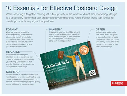
Modern is here to give your brand the royal treatment and stand out with successful print promotions and direct mail campaigns.
By Sven Johnson, Senior Graphic Designer, Modern Postcard
Call a Direct Marketing Specialist at 800.959.8365.
Sources:
poynter.org
ams.aaaa.org*