
Choosing Color in Direct Mail Design: Purple
While 80% of the success of your direct mail relies on a combination of mailing to the right audience with the right offer and message, the other 20% relies on an impactful design that will grab your audience’s attention long enough for them to want to read your message. That’s why choosing the right mix of fonts and color treatments plays an important role in the overall response and success of your direct mail campaigns.
When your mail piece calls for a stand-out color, purple can be a great choice. Purple is known for its bright saturation and is said to have the power to uplift, calm nerves and encourage creativity. Here’s a list of meanings and interesting facts to consider:
- Purple combines the stability of blue and the energy of red and retains both warm and cool properties
- It represents royalty, wealth, power, extravagance, wisdom, dignity, devotion, peace, pride, mystery and magic
- The first man-made synthetic dye was purple, discovered in 1856 by an English chemist William Henry Perkin – he named it “Mauveine”
- Different shades of purple have different meanings – bright purple suggests riches and royalty; light purple represents delicacy and nostalgia; and dark purple elicits feelings of gloom, sadness and aggravation
- During the Silver Age of comic books, those with purple on their
covers sold better
Purple is powerful depending on its use. It has the power to uplift and the power to depress. It has a richness and quality to it that demands respect and attention. When using a commanding color like purple in your direct mail campaigns, more isn’t necessarily better and can end up working against you. Limit your color pallet to 1-2 colors that work together to get your message across quickly and complement your overall design.
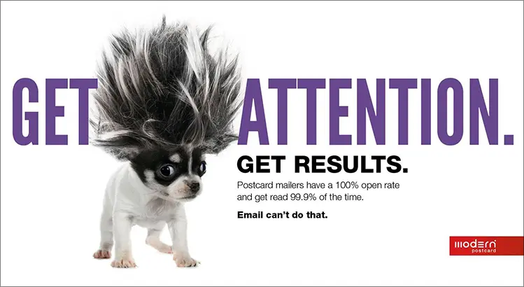
Here is an example of one of Modern’s direct mail campaigns using purple for the front and back headlines. The color paired well with our quirky image choice, and together, created a fun, stand-out promotion that grabbed our customers’ attention. This mailer performed very well for Modern and we even had a client request to repurpose our design for their marketing piece.
Remember, as people sort through their daily mail, you have mere seconds to get them to decide whether they read your mailer or toss it into the recycling bin. Good copy and a strong offer are essential for direct mail success, but the colors you choose can also affect response. Take the time to develop a design and color scheme that will get attention and results.
Call a Direct Marketing Specialist at 800.959.8365.