
Modern Marketing Blog

How to Create Ideal Customer Profiles in Direct Mail Marketing
TL;DR Creating an ideal customer profile is essential for successful direct mail marketing. By analyzing your best customers, using tools like the Clarity Dashboard, and continuously refining your approach, you can target the right audience, craft...

Why Direct Mail Is the Growth Lever Digital Agencies Need
At Modern Postcard, we’re known for leveraging postcard campaigns to connect businesses with their audiences. Yet, the history of the postcard predates our company and the concept of Direct Mail Marketing by centuries.

How Retailers Crush Back-to-School and the Fall Season With Direct Mail
At Modern Postcard, we’re known for leveraging postcard campaigns to connect businesses with their audiences. Yet, the history of the postcard predates our company and the concept of Direct Mail Marketing by centuries.

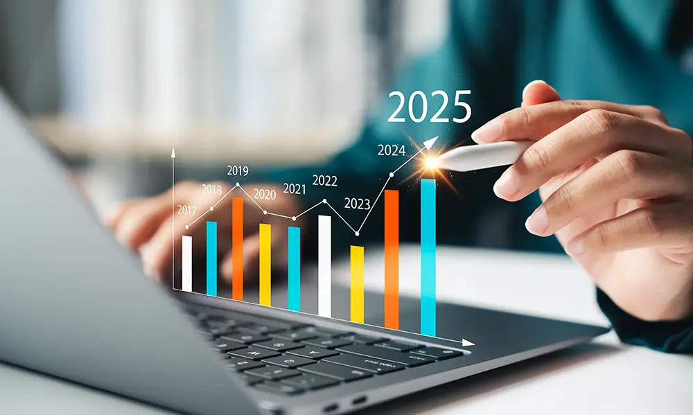
Direct Mail Performance in 2025: The Quiet Channel That’s Making the Loudest Impact
At Modern Postcard, we’re known for leveraging postcard campaigns to connect businesses with their audiences. Yet, the history of the postcard predates our company and the concept of Direct Mail Marketing by centuries.
USPS News: 2025 Postage Rate Changes
The United States Postal Service (USPS) will implement its next postage rate increase effective July 13, 2025, as part of its Delivering for America 10-year strategic plan. These changes affect bulk mail categories, including Marketing Mail and...

B2B Direct Mail Best Practices
TL;DR B2B direct mail is a powerful solution for overcoming common marketing challenges such as digital fatigue and extended sales cycles. Through targeted, personalized, and well-designed campaigns, businesses can effectively engage key...

Direct Advertising Tips for Retailers
TL;DR Retailers need effective ways to stand out, drive customer engagement, and increase sales. Direct advertising delivers one-to-one engagement through tangible, personalized marketing that creates lasting impressions and reinforces your brand...
6 Proven Ways to Connect Digital to Direct Mail Marketing
TL;DR Direct mail is experiencing a renaissance in 2025, not as a replacement for digital marketing but as its perfect complement. While digital channels face increasing fatigue and clutter, physical mail continues to capture attention with...
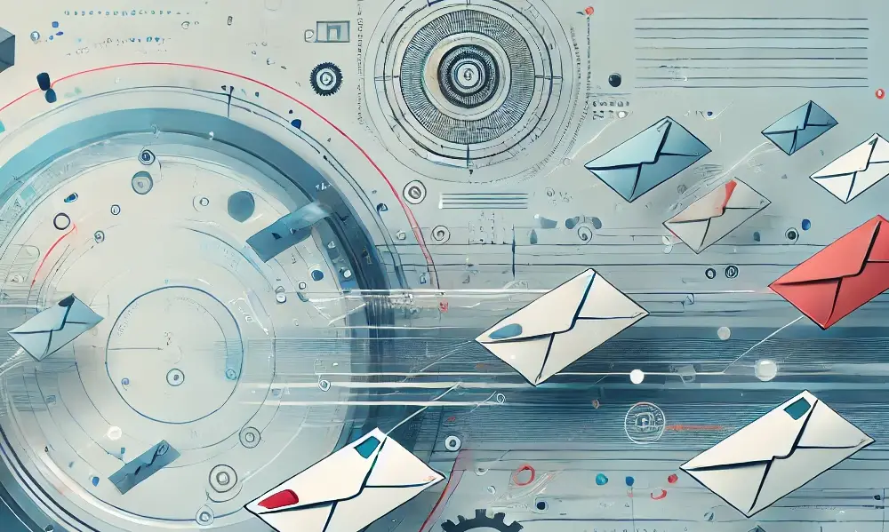
What is Automated Direct Mail?
TL;DR Automated Direct Mail leverages real-time data to deliver personalized physical mail based on specific customer behaviors or triggers. This innovative approach helps businesses cut through digital noise by combining traditional marketing's...